Written By Peter Donker
2019-06-26
A few of us are discussing whether to move away from Slack as a collaboration tool in favor of the forums on the new community website. The two main drawbacks with Slack are (1) that it is "yet another tool" and therefore not immediately available to someone who wishes to join a conversation and (2) that old discussions fade away in time (and also not searchable etc).
But there is a reason for Slack's popularity. The forums look and feel like a tool that was cool 15 ago. They are clunky and slow, whereas Slack is a hybrid between a forum and a chat. The question I'm asking myself is this: is there a way to have our cake and eat it? Could we improve the forums so as to mitigate it's biggest drawbacks and integrate some of the advantages that Slack has.
Slack
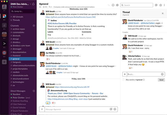
As we can see in the Slack interface there are three parts to this: the channels to the left, then the conversations in the middle and, if you select an individual conversation, the replies to the right. This follows a logical left-to-right pattern of drilling down into subjects. One thing I've noticed is that most of the time people do not use the reply feature to continue a single thread but will reply in the main window below it. You're even encouraged to "abuse" the system in this way as your replies are otherwise hidden from view until you click on the thread. Adding your reply in the main thread is both faster and more visible. IMO this is a flaw in the chosen design/approach. Other than that it works great with dropped in screenshots, links etc. Note the "like" function is also heavily used.
Forums
Since the acquisition of Active Modules by DNN Corp and the subsequent release of the Active Forums module as open source to the community, this has become the de-facto "core" forums module for the framework. It is quite feature rich and was already a very popular forums solution back when it was a commercial module. But the release to the community meant that what remained of the community around the original core modules was more or less pushed off a cliff. And given that the original makers of Active Forums had no intent to actively keep developing this module, we effectively got "abandonware" that was "the best free solution out there". A bit of a mixed bag. Several people have taken it upon themselves to improve this module over the years and have sunk hours into this. But as of this writing it is not under active development from what I can tell.
But before we jump to the conclusion that this is why this forums module lingers, let’s not forget another huge factor in the demise of open source forums on DNN. In my opinion the biggest contributor is that forums in general have been overtaken by other approaches. Similar to how CMS's have been overtaken by niche players like Wix and Squarespace, so forums have been replaced by tools like Slack and Stack Overflow.
Modernization
Anyone who's gone into the code of the Active Forums module knows it is not going to be easy to work on. There is a lot of code and the patterns used date back quite a bit. Keep in mind that the first lines were written over 15 years ago. 15 years in technology is like 80 in human years. If you were to write a module like this today, the code would look very different. This makes it harder for developers like myself to tweak the module. It takes a relatively long time to "get into the code" (understand where you need to be to make an intervention) and you have to use old patterns to do what you want to do (often require more lines of code). This can be very unrewarding work. Usually we are motivated when asked to work on clean and modern code, not so much when asked to work on legacy code.
We'll pick and choose our battles as we go forward, though. What would be the first thing to attack is to get rid of some of the "awkwardness" of the module. There are quite a few things that are not often used, confusing or no longer "of this day". Let's look at the new post UI:
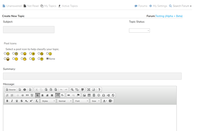
Besides the fact that 80% of the screen is taken up before getting to the body of what you wish to say, there is a lot of stuff there that could be axed. Although some may have used Icons and Status, it is by far not common to use it. In fact, it impedes "getting to where I want to" when writing a post. When I've clicked "New Post" I want to start writing, not having to decide about metadata. Plus: the subject box is so small that it makes me wonder what should be in there. Just a couple of words? A single keyword? And what is the difference between "subject" and that single line summary? Not sure. Do I have to write a summary for a simple forum post? Really? OK, it's not quite Twitter, but a summary for a forum post seems awkward to me. And those icons? Aren't we now in a place where we add emoticons within our text? Instead of qualifying an entire post with one? Looks like someone 10 years ago saw the emoticons emerge and thought: I'll use those for labeling a post. But we've moved on. It doesn't get used this way in 2019.
To mark down or not to markdown
Let's talk about text editing. Over the year's we've had various "Editor Providers" as they're known in DNN. Whenever a module indicates "please show a HTML editor here" the framework will drop in the component that administrators have decided will be used for the site (in fact it's for the entire installation, but that is nitpicking). Our current default editor is the "CK editor". The idea is that it shows a UI resembling Word for typing text so that users have an experience they are roughly familiar with.
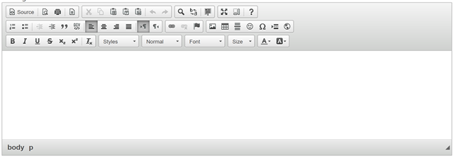
But let me poke the bear here. An inline HTML editor has always been a bit of a mixed blessing. Because on the one hand we want to give the user the ability to create styled content, but for the person responsible for the design of the site it has been a nightmare. The HTML code generated would set a lot more than you'd want. Think font types and sizes. Add to that the ability to actually switch to HTML view and create broken HTML and you see the mess you can get yourself into. So for years the HTML editor has been the battle ground for content editors vs designers. And as a result some of us do not expose editing to end users and instead use structured content solutions to make sure the designer keeps control of layout.
It got me thinking about the use of Markdown. This technology has emerged over the past years as the de facto new standard for writing HTML content in our circles. It would probably not have been as widespread as it is today without Github. But the fact is that Markdown tries to solve the problem sketched above: how to allow an editor to style content without having the ability to screw up the site? The main criticism leveled at it is that it is too "technical". And for a long time I was incluned to go along with that. But recently I have begun to shift my opinion on this. For two reasons:
1. Our existing methods are also "technical". We gloss over the fact that the regular editor is also something someone needs to learn, just like they learn Word. There are an awful amount of buttons there. And I'd argue that most are never used because it is not entirely clear to the end user what it does.
2. Markdown is not *that* technical. I mean: people quickly got used to typing smilies using colon-dash-close bracket. Markdown is not that much more complex than that. It is a simple convention for headers and text styling.
The advantages are obvious. You can now eliminate all HTML errors as the end user is no longer close to HTML. And for the uninitiated it works just fine as typing text without any Markdown items in plain text just shows plain text as you'd expect. I.e. the fallback is perfectly acceptable.
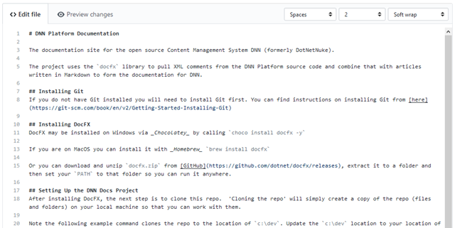
My gut feeling is that if the forums editor would be a simple textbox with markdown being accepted would reduce complexity and improve ease of use. It doesn't exclude using buttons to do things like bold, italic or quote as this can easily be done client-side. And as an added bonus: code inclusion would become so much simpler, too.
Display
Besides editing there is display. There are three common views: forums, posts and a single post (thread). So to get to any item you may be interested in you are at least two clicks away when you first get to the page. Secondly there is a lot going on on these pages that distracts me from where I wish to go. As a result the amount of screen real estate used for the text that matters is relatively small (this is where Slack does a much better job). Let's list a few:
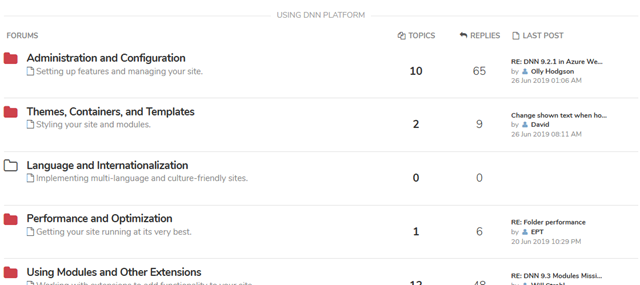
For each forum I see the subject of the last post, by whom and when. I'd argue the only relevant info is the title of the forum and if there are new posts for me. In slack this is simply whether it is in bold or not. The stats are for stats lovers. IMO we display them because we have the data, not because it's particularly useful.
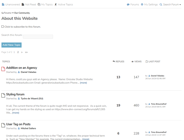
In the posts view (i.e. single forum) we see (besides the title) stats, who started it, a summary and who last replied and when. Again I think we can condense this. All this data forces us to read. Having a simple style decision (e.g. bold for unread and maybe red for unanswered) would make it easier to overview what is happening.
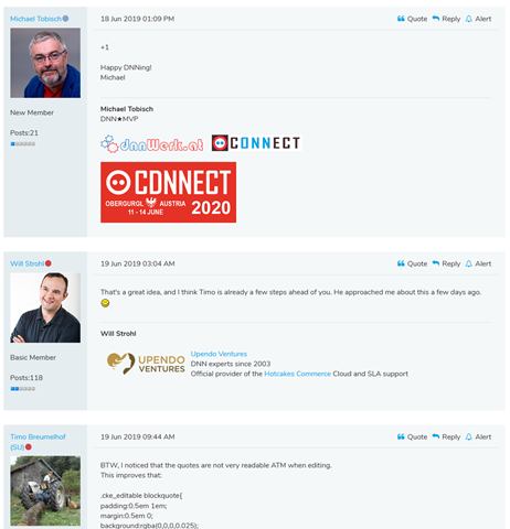
For the post thread it gets really wild. We are now showing to the left of each message various information about the user including a mugshot. Then below the message is an HTML signature that users can tweak themselves. I understand why we have this. We want to reward those that reply with maximum visibility. It's "gaming" as we used to do back in the day. But as these signatures get more elaborate I find it harder to see the information through all the publicity. Again, this is where we fail to focus on user experience. Just check how much screen space is being consumed by a single line reply …
A new UI direction
As we compare the various solutions out there I think we would do ourselves a huge service by following these two guidelines:
1. Cut all the excess UI garbage we're dragging along and show the end users what matters.
2. Show the UI interaction where it is most useful to the user in such a way that is aimed at our goal.
Ad 1: We could greatly condense the views as described above plus we might even make the UI work more like Slack by having the list of forums on the left as clickable navigators.
Ad 2: We could reduce the edit UI to a fairly simple Markdown editor and show it both as "quick reply" and "new post" UI directly in the posts view.
Final notes/disclaimer
The above is opinion. Keep that in mind. It's up to all of us to find a way forward. I'm merely pointing out where I think things should go.
The above is in no way meant as criticism of anyone. Least of all those that implemented the forums on the community website. They did a terrific job and I wholeheartedly applaud what they've done.
I acknowledge that a large part of the success of Slack is also due to its mobile app. Having notifications in your pocket is a huge bonus. Whether we should go there would be the topic of another discussion IMO.
Please feel free to comment below ...